darkSVG ↓
The pieces that make us OpenBracket. A working reference for keeping every expression clear, considered, and unmistakably ours.
Precise structure.
A little unexpected depth.
01 / ONE IDENTITY. EVERY FORMAT.
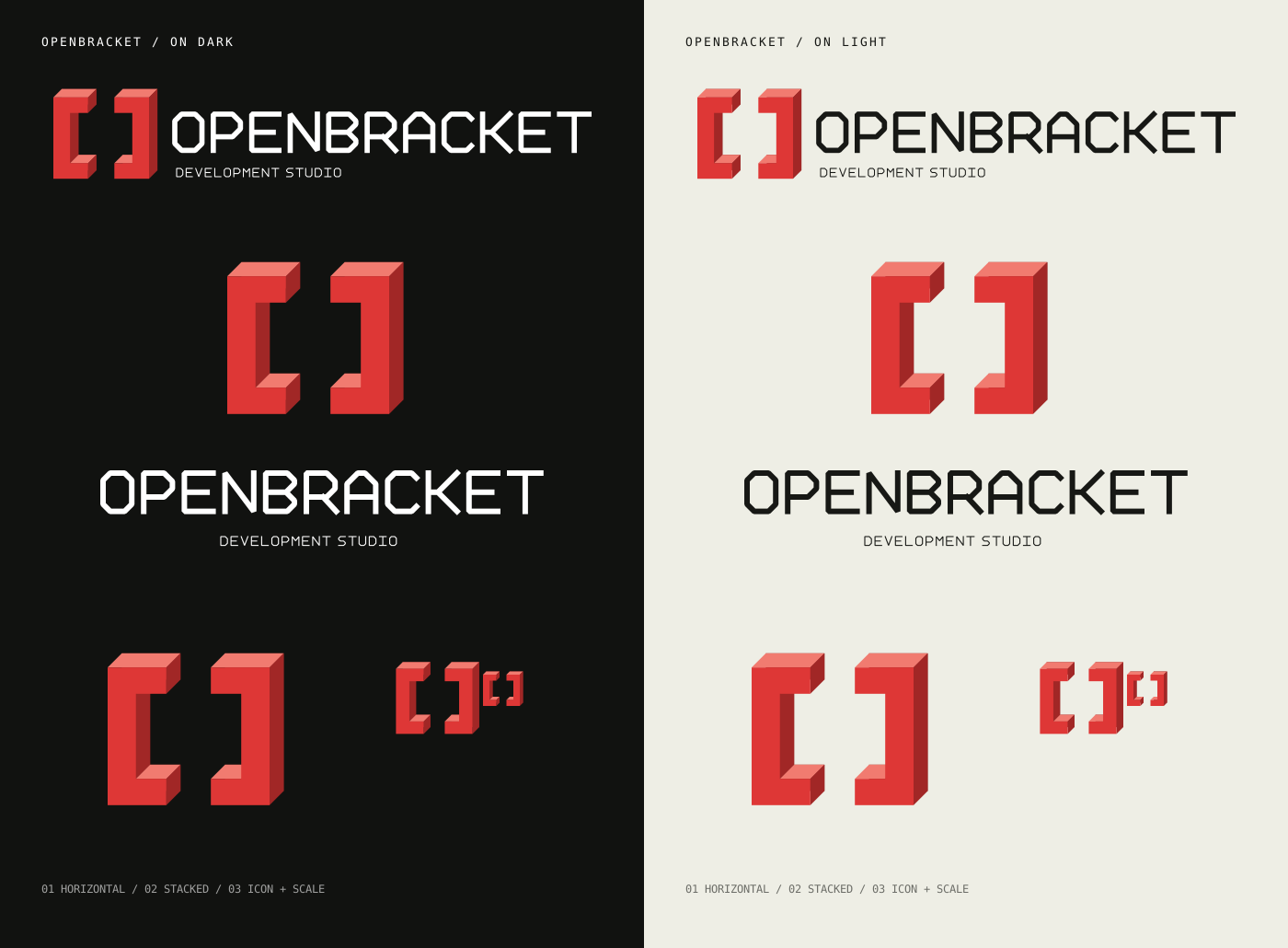
Original vector artwork, ready for light and dark surfaces. Each SVG has a transparent background and lettering built from paths.
Primary lockup · recommended minimum 280px
Centered lockup · recommended minimum 220px
Compact mark · minimum 24px; prefer flat below 32px
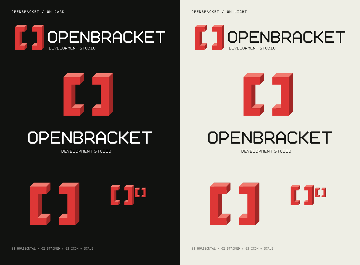
The comparison sheets collect the current family. The previous logo is archived for reference; use the current SVGs for new work.
02 / GIVE THE MARK ITS SPACE.
Keep the geometry intact, the lettering legible, and the surrounding space deliberate.
Scale the complete artwork evenly. Keep at least one bracket-stem width of clear space on every side.
Never squeeze, skew, rotate, or rearrange the mark and lettering.

Use white lettering on dark surfaces, charcoal on light surfaces, and the flat icon for very small placements.
Avoid recoloring, extra shadows, outlines, busy backgrounds, and recreating the wordmark with a font.
03 / WARM NEUTRALS. A RED THREAD.
Red anchors the identity. Soft, slightly olive neutrals give the interface warmth; the accent adapts to each theme.
#DE3736#F17B70#A12726#922522#822020#C52D2D#B62828#FFFFFF#171815#000000#111210#F5F4ED#1A1C17#1B1C19#20221C#ADB0A5#F27B75#3C3E36#30332B#73786A#FFB0A7#C5E0B7#F7F6EF#171815#FFFEF8#EEEEE5#E9E9DF#55594F#A32929#B3B7A7#E1E3D7#7E8571#A52323#2C642DHeader: dark #111210F7 / light #F7F6EFF7. Grid: dark #FFFFFF08 / light #00000009. Shadow: dark #000000 / light #C3C7B7. Eight-digit hex values include transparency.
Use the theme’s text and accent tokens for readable copy. Brand red and the dimensional highlights belong primarily to artwork; buttons pair white text with #C52D2D.
04 / STRAIGHTFORWARD, WITH CHARACTER.
Four locally hosted font families power the site. WOFF2 files are served from our own domain, with no requests to Google Fonts.
Google Sans, sans-serif · variable 400–700Headlines, paragraphs, navigation, and buttons. Regular and bold weights establish the hierarchy.
ABCDEFGHIJKLMNOPQRSTUVWXYZ
abcdefghijklmnopqrstuvwxyz
0123456789 & @ # ? !
Gelasio, serif · variable 400–700Italic emphasis within headlines. Bracket posters also use the upright serif. The home hero pairs Google Sans 500 with Gelasio italic 500 at 94% of the heading size for a balanced visual weight. Keep the accent selective.
Aa Bb Cc Dd Ee Ff Gg Hh Ii Jj
0123456789 & ( ) [ ]
“Courier Prime”, monospaceEyebrows, section numbers, metadata, and terminal details. Main labels use 13px and 0.8px tracking; regular and bold weights support the hierarchy. Compact controls use smaller sizes.
ABCDEFGHIJKLMNOPQRSTUVWXYZ
abcdefghijklmnopqrstuvwxyz
0123456789 / [ ] →
Doto, sans-serif · variable 100–900A dot-matrix accent for the DFW maker’s stamp and keyboard edition label. Use bold weights and short phrases; keep small functional text in Courier Prime.
Aa Bb Cc 0123456789
OPEN POSSIBILITIES.
The angular OpenBracket lettering is custom vector geometry, not a typeface. Use the supplied SVG lockups to reproduce it.